Tips on DTP
Prepping Your Files For Economical Layouts
He didn't know kerning. He didn't know leading. He didn't know TT from PS and she was dashed if he could hyphenate in English, let alone a foreign language. So Veronica was happy when Bill chose a career that demanded no accuracy, professionalism, or, for lack of a better word, character: United States Senator.
|
Introduction
There's an old comedy bit where a tourist asks a local for advice or directions through an interpreter.
Tourist: "Can you recommend a hotel?"
The interpreter turns to the local and translates the question. The local answers with several profuse minutes of comments, elaborate hand gestures, and hyper-animated expressions. Finally, he signals the interpreter that he's finished. The interpreter turns to the tourist and translates:
Interpreter: "No."
English, with more words than any other language (German is a distant second), is often able to sum things up in fewer words than other tongues. This can mean problems when laying out translations via DTP (desktop publishing).
Foreign languages can, on average, take 30% more room than English. There are ways to compensate for this and to help a translation fit and it's likely you and your DTP staff have no idea what they are. That's because it's not enough to be able to do DTP:
You have to know how to DTP the language!
Not to worry. A full-service agency can handle the DTP end so your materials look as good as they sound.
The Most Common DTP Mistakes
It's sad to read a beautiful translation that looks awful on the page or screen. Sadder still is to see it with mistakes that weren't in the text when it left our hands. As we said, it's not enough to know DTP in English; you have to know how to DTP the language.
Here are some of the usual errors we find introduced by a DTPer who isn't language savvy.
|
He says that even though the translation was good, you really messed up the DTP.
|
|
|
Incorrect hyphenation
American-made DTP programs don't know Hofdichter from poet laureate, but they valiantly try and hyphenate whatever they see as "too long." Trouble is, all the European languages have their own rules, rules which aren't even given in native dictionaries (very annoying). That's where hyphen errors creep (or seep) in. One solution would be to turn hyphenation OFF. But if your text columns are too narrow or the foreign words too long (or both) you get overly ragged margins and scrunched, buckled words.
|
|
|
Incorrect capitalization
Few things are sacred in English-language DTP. We play fast and loose with everything, including capitalization:
BIG SALE TODAY or
Big Sale Today or
BIG sale today or
bIG sALE tODAY etc.
You don't have to worry about pesky things like accepted uses and accents because in English, there aren't any. Such is not the case in languages like Spanish or German.
Here's just one case where all heck broke loose because the DTPer didn't know the rules. The language is German. The original English (in all caps!) was "REMOTE SWITCH JACK"; the DTPer then changed this to upper and lower case and did not know how to capitalize the German words, so he didn't. Nor was the double-s in "FUSS" handled correctly; in lower case, it should be "Fuß" and should in fact, become one with the last word: Fußschalter.
Golden Rule: Never put headers and sub-headers in all caps in the original language.
|
|
|
Incorrect punctuation
A professional English DTPer should know the customs of English punctuation. She cannot be expected to know the rules of other languages. Too often, we see work which we've submitted and been approved by the client come back from the printer with mistakes. What happened? Some well-meaning person thought the punctuation was wrong and wanted to be helpful by fixing things. French, for example, has spaces before and after quotation marks. It also uses different punctuation marks from English. We've seen not only the spaces removed but English quotes substituted!
|
|
|
The wrong tool for the job
Today's word processors can do amazing things: charts, tables, simple graphics, text-flow around graphics, even text-to-speech. What they can't do is massage text to fit! Word processors usually have point, leading, and kerning changes which can only be made in 1 point increments. That's simply not enough. They also don't have the ability to make character shapes wider or narrower. If the page layouts you give NOW Translations has a snowy meadow's worth of white space on each page, go ahead and use Word, WordPerfect, Nisus, et. al. If your pages tend to be gray with text, lots of call outs and captions, etc., please consider including PageMaker or XPress in your current arsenal.
|
|
|
Font Crazy
English DTPers probably have more fonts families available to them than all Asian and East European languages combined. They take their font selection for granted. They shouldn't. Most of the hipper looking families do not support even the most common West European accents. It's the DTPer's responsibility to make sure those characters are supported in Spanish, French (etc.) or all foreign versions will look considerably different from the original, with all the snazzy, groovy, wow fonts being unusable.
We were recently asked what would happen if the accent over a letter in Spanish wasn't used because the font the programmer had used didn't support this accent. We told him what would happen: the word would be wrong; there are no other options.
|
|
OK, you now realize that you have to know the language, but this doesn't mean your in-house or freelance DTPer shouldn't make the foreign-language DTPer's job easier. If the following steps are followed in the original layout, the headaches for foreign DTP will be few.
|
|
|
Leave plenty of white space.
|
|
|
Don't use a font size that's too small (remember, if you're using 6 pt already, it may have to do down to a tiny 4 pt).
|
|
|
Use a respectable amount of leading (the space between lines).
|
|
|
If there's too much text for too few pages and you can see that it's only going to get tighter (and uglier) in the foreign version, ask your writer to edit the text down.
|
|
|
Make sure the fonts you're using support foreign characters.
Tip: in the world of layout, Postscript fonts on a Macintosh are infinitely more reliable than TrueType or Postscript on a PC running any OS.
|
NOW Translations knows how to make text fit and look good. We also know when a graphic can be moved and when it can't so you don't have to re-do separations. If your company has oodles of money and doesn't mind completely re-doing the film for every project then the following won't interest you. But if you're like the majority of companies (us among them), then you want to avoid as many additional costs as possible. Read on.
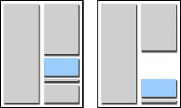
Look at the layouts below. The page on the left is full. It may have looked fine in the original, but there's little room for the target language. The page on the right has been reworked to leave some space between the body copy and the photo and its caption. When the translation is flowed into this page, with very little resizing, the text should reach the photo (blue) and still look great.
Do it with Style
Along with leaving enough white space for the translated text, you have to think ahead to what the person handling foreign DTP needs. In other words, you're DTPing for two!
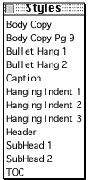
Notice the Styles window on the right. This is similar to most of the Styles windows we see when we receive files at NOW Translations. There are three types of main text: Body Copy, Body Text, and Body. Since there should be only one style that reflects the main text, we have no idea what the DTPer wants us to use. Also, there's a "+" next to Body Copy. This tells us that the style has been altered, but how? No way to tell. Since virtually all projects have deadlines, this is one of the major obstacles left to us and it can be a real time eater to sort out.
|

|
|
|
This is what the English DTPer should have had in his style menu. "Body Copy" is what's used for most of the text. The one time this needed to be changed (smaller font, tighter kerning, whatever) was on Page 9 and that is clear to the foreign DTPer because the style actually says something's different on Page 9, "Body Copy Pg 9." The style "Body" wasn't used at all and has been deleted.
Notice that throughout, there are no "+" sign indicating that the DTP was changed at some point but no one else but the original layout person knows why. All styles have their own descriptive names and if the foreign DTPer would click on any text in the document, the correct style would be checked in the Style Menu. No guesswork involved.
|
|
|
Make the font (characters) smaller (usually only a small decrease of 1 or 2 points is necessary).
|
|
|
Decrease the leading (space between sentences).
|
|
|
Decrease the kerning/tracking (space between letters/words).
|
|
|
Increase the size of the layout area (either the page or the graphic in which the text appears).
|
|
|
Add hyphenation (even if the original used none).
|
|
|
|
|
|